How to Print Deep Black: Rich Black vs Pure Black
Printed blacks rarely look as dark as they do on screen. The fix is choosing the right kind of black for your file, knowing what your printer actually does with it, and testing on the paper you will use.
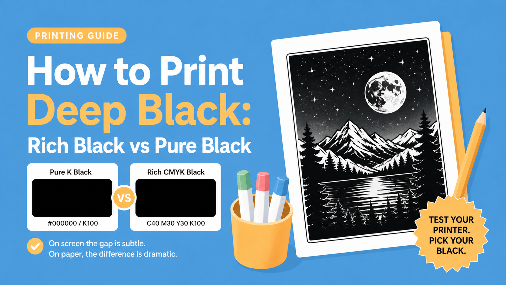
Pure black vs rich black
Pure black uses only the black ink (K in CMYK, or #000000 in RGB). It is the sharpest, cleanest option, with no risk of color fringing.
Rich black mixes black with cyan, magenta, and yellow. The extra ink layers absorb more light, so the result reads as a deeper, more atmospheric black.
See it on screen
This is roughly how the two feel side by side on a calibrated display. The difference becomes much more pronounced once ink hits paper.
On screen the gap is subtle. On paper, pure K can look slightly grey and show the paper grain, while rich black sits denser and more uniform.
A bit of color theory

Screens and paper work in opposite directions, and that is the whole reason black is harder to print than to display.
Screens add light. A pixel starts black, and red, green, and blue sub-pixels light up to build a color. Turn all three on at full strength and you get white. Turn them all off and you get black. #000000 on a screen is just a pixel doing nothing.
Paper removes light. A blank sheet already reflects every color back to your eye, which is why it looks white. Each ink you lay on top filters something out: cyan blocks red, magenta blocks green, yellow blocks blue. Stack all three and almost no light should bounce back, which in theory means black.
In practice, real ink pigments are not perfect filters. They each let a little bit of unwanted light slip through, and those leaks add up to a warm muddy brown instead of a clean black. So printers add a fourth ink: K (key), a dedicated black pigment.
But K alone is not perfect either. Pure black ink absorbs most wavelengths, but a few still bounce back, which is why a K-only fill often looks slightly gray on paper, almost like very dark charcoal. This is where rich black comes in: by layering C, M, and Y on top of K, the muddy brown soaks up the wavelengths K misses, and K covers what CMY cannot reach. The two flaws cancel each other out, and the result reads as a deeper, more uniform black than either could produce alone.
A bit of printing theory
Three things happen between your file and the paper:
- Halftoning. Inkjets and laser printers cannot vary ink density continuously. They simulate it with tiny dots of solid ink. A pure K fill is one layer of black dots. A rich black fill stacks four layers of dots in slightly rotated screen angles.
- Dot gain. Ink spreads as it soaks into paper. Each dot ends up a little bigger than intended, which darkens midtones and can blur fine outlines, especially on uncoated stock.
- Registration. Each color is laid down by a separate pass or print head. If those layers do not line up perfectly, you get misregistration: thin colored halos along the edges of your blacks.
Pure K only uses one layer, so registration is a non-issue. Rich black uses four layers stacked on top of each other, which is where the risk of fringing comes from.
What misregistration looks like
Below is an exaggerated illustration. The black shape is solid, but the cyan, magenta, and yellow layers have shifted by a fraction of a millimeter. On a real print this is usually subtle, but on thin lines it can be very visible.
Notice the cyan halo on the left edge and the warm fringe on the right. That is the four-color stack failing to line up. On a coloring page outline, this shows up as fuzzy or slightly colored lines instead of crisp black ones.
K-only vs CMY-heavy: it is a taste choice
Pure K is usually chosen for technical sharpness, but CMY-heavy blacks have their own charm. They can feel:
- Softer, less harsh on the eye
- Warmer or cooler depending on the ink balance
- Visually richer on certain paper stocks
For art prints, illustration books, and softer-style coloring pages, many people actually prefer that look. The tradeoff:
- K-only black: sharper, cleaner, safer for thin outlines
- CMYK composite black: richer tone, but higher risk of slight color fringing or fuzzy edges if the printer is not perfectly aligned
For coloring books
Honestly, I lean toward CMY-leaning blacks for coloring books. The lines feel a bit warmer and friendlier, and the page does not look as stark. But this really depends on your printer, your paper, and your taste.
The single most useful piece of advice: test your printer. Print the same page with pure K and with a rich black mix on the exact paper you plan to use. Compare them in daylight. The winner is whichever one you like looking at.
A safe rich black recipe to start from
If you want a starting point for CMYK, try C 40 / M 30 / Y 30 / K 100. It stays under the total ink limit of most home and office printers, dries cleanly, and avoids the muddy look you get from maxing out every channel.
Working in RGB? Export at #0A0A0A rather than pure #000000 and the driver will route it through all four inks.
Quick tips for darker prints
- Test both pure K and rich black on your actual paper before committing.
- Use bright white paper, at least 100 gsm. Thin paper soaks ink and dulls black.
- Set your printer to its highest quality mode and pick the matching paper type in the driver.
- Let the page dry flat for a minute before stacking.
- If your printer has separate "photo black" and "matte black" cartridges, match the mode to your paper finish.
- Run a printer alignment routine before a long print job. It minimizes registration drift.
There is no universal right answer here. Pick the black that fits the feeling you want, and let the test print decide.